How to Make Window Buttons Look Proper for Dark-Themed Mac Apps
It’s been a while since OS X El Capitan came out. Inboard still doesn’t support Split View. It’s not because we don’t want to. It’s because we are not using the system standard window buttons. Instead, as a dark-themed app, we are using customized window buttons for a better look.
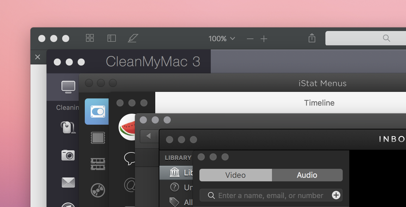
When a window is inactive, OS X draws gray window buttons automatically. However, if the window has a customized dark theme, the gray is actually too bright compared to the dark background. Here is a screenshot showing 6 apps (PDF Expert, CleanMyMac, iStat Menus, Tweetbot, Reveal, Inboard, and FaceTime) with dark window background. Needless to say, the window buttons for PDF Expert and CleanMyMac don’t look ideal.

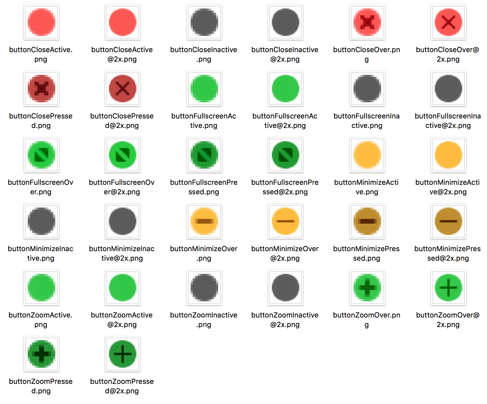
What we’ve been for Inboard is to hide the system buttons first, then add our own NSButtons. By using customized buttons, we can choose a darker color for the window buttons in the inactive state. This requires a huge amount of assets. But it’s worth it.

Then El Capitan came out with the introduction of Split View. It should be trivial for a standard Mac app to support that. However, the split mode is fired by holding down the full-screen button, which is very hard to mimic using a normal NSButton. For this reason, we still don’t support Split View until Inboard 1.0.6.
Today I got another chance to look into this. I found that both Tweetbot and FaceTime have the correct behavior, and they support Split View. With a little help from Hopper, I realized that OS X would use a darker color if the window is in the vibrant dark appearance. Setting the whole window as vibrant dark will affect all the widgets inside that window. However, we can set appearance only for the buttons:
self.closeButton = [self standardWindowButton:NSWindowCloseButton];
self.miniaturizeButton = [self standardWindowButton:NSWindowMiniaturizeButton];
self.zoomButton = [self standardWindowButton:NSWindowZoomButton];

self.closeButton.appearance = [NSAppearance appearanceNamed:NSAppearanceNameVibrantDark];
self.miniaturizeButton.appearance = [NSAppearance appearanceNamed:NSAppearanceNameVibrantDark];
self.zoomButton.appearance = [NSAppearance appearanceNamed:NSAppearanceNameVibrantDark];
Yay! Problem solved. We do not need to use customized trafic light buttons anymore. Split View, see you in Inboard 1.0.7.